Creating a platform

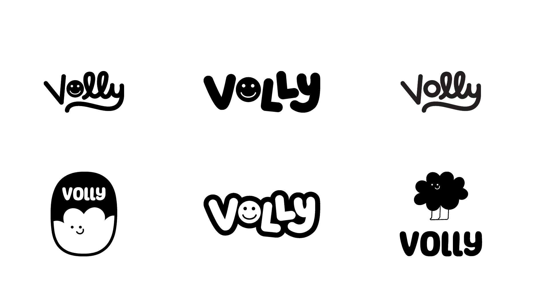
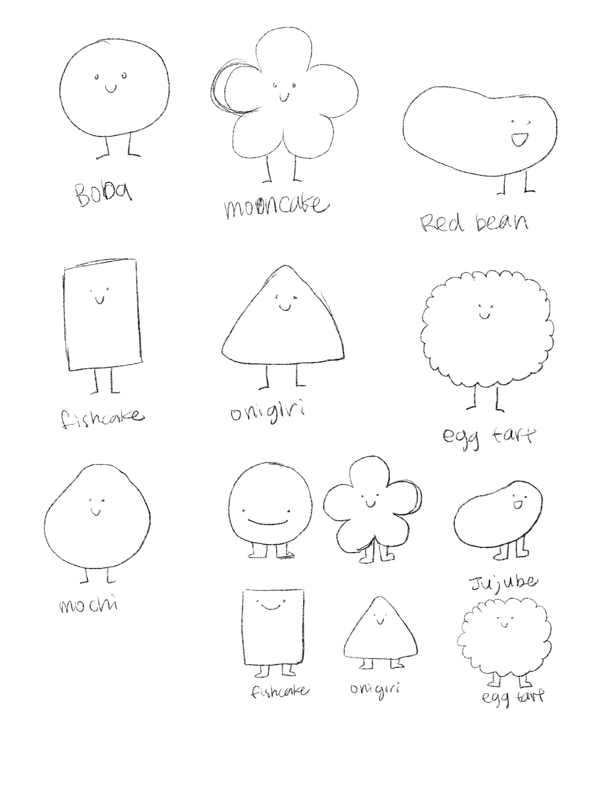
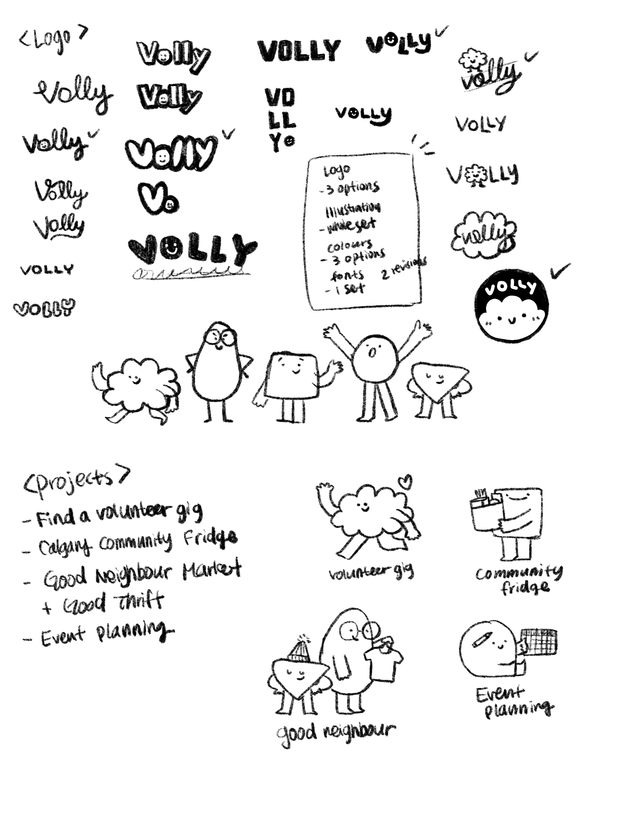
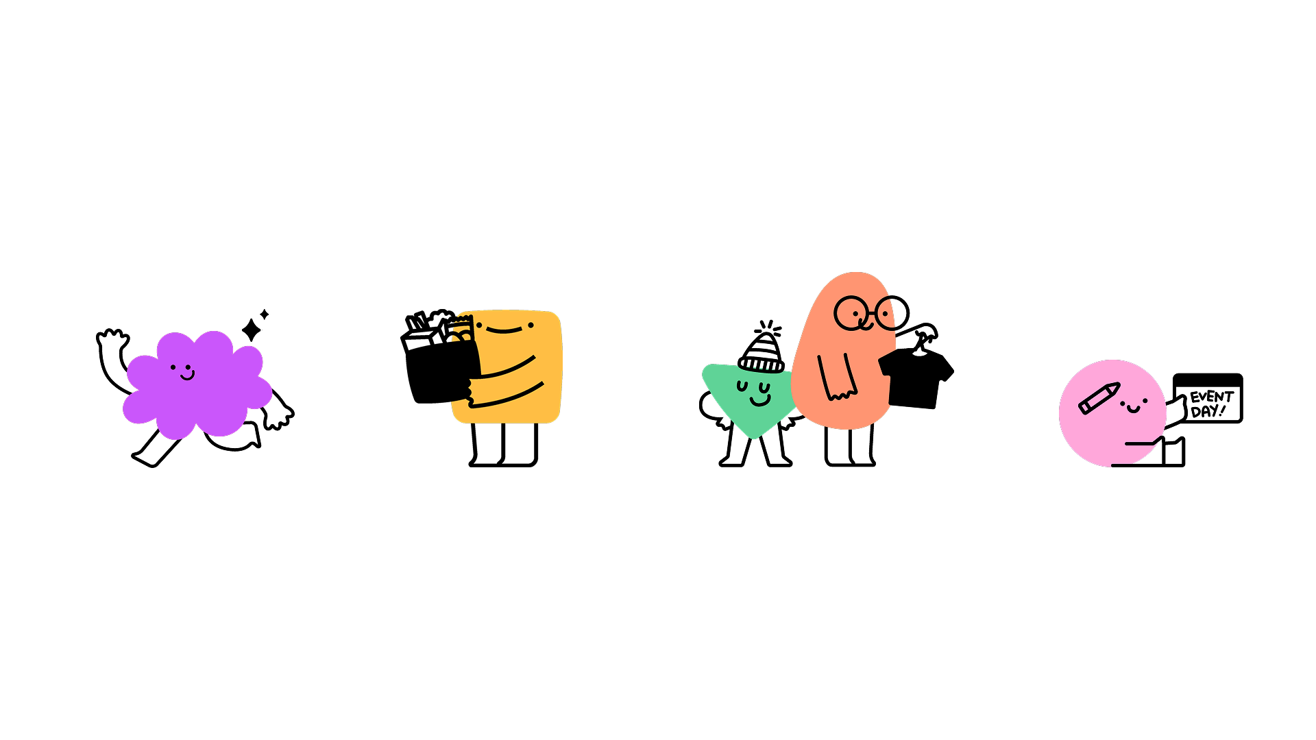
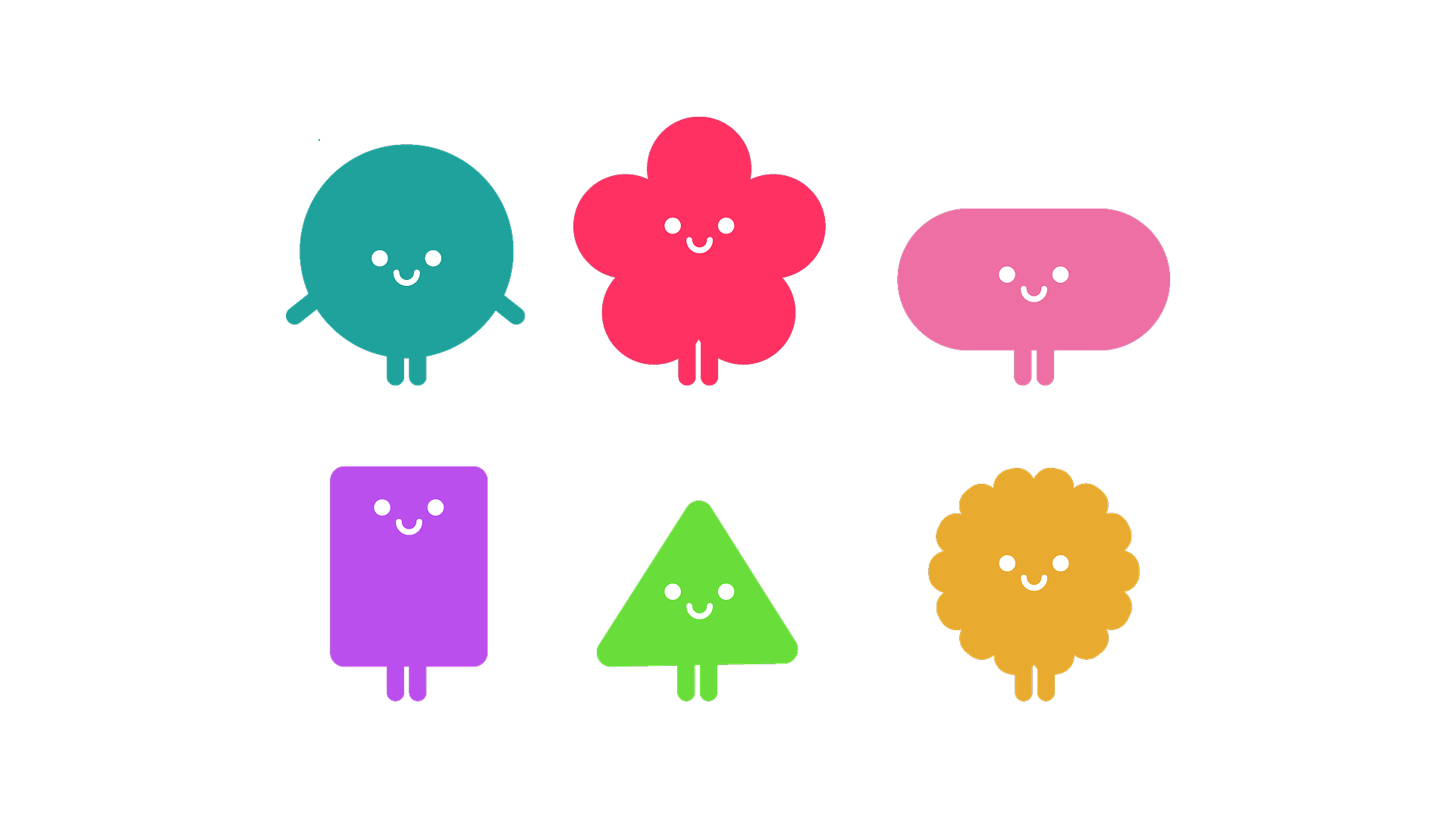
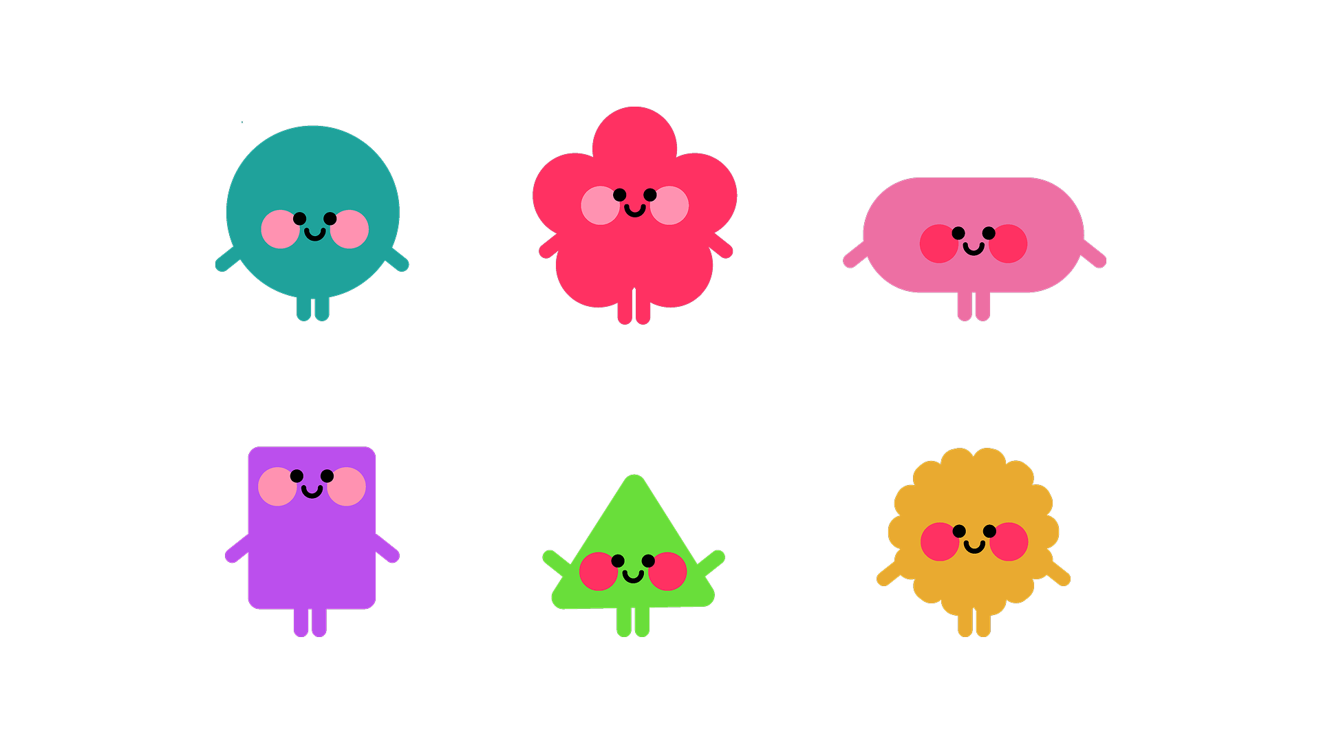
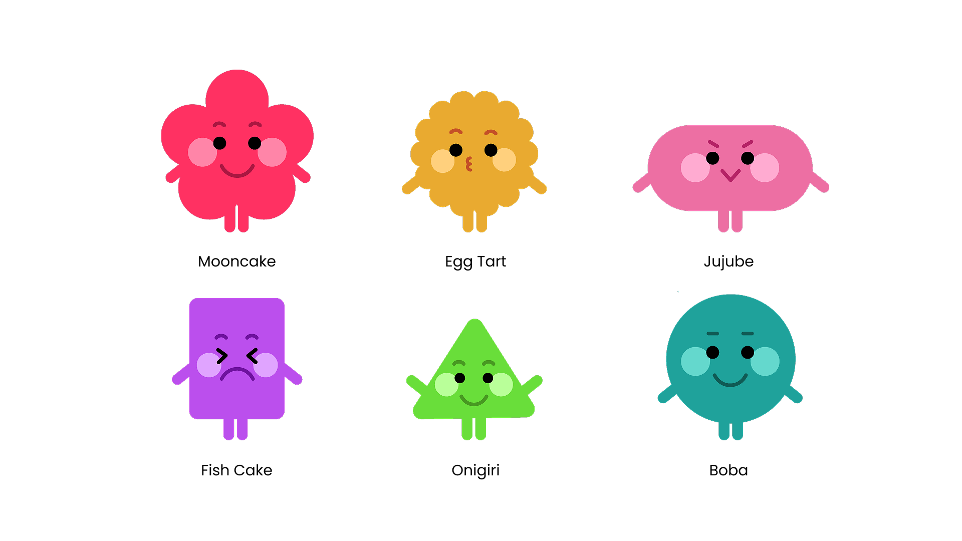
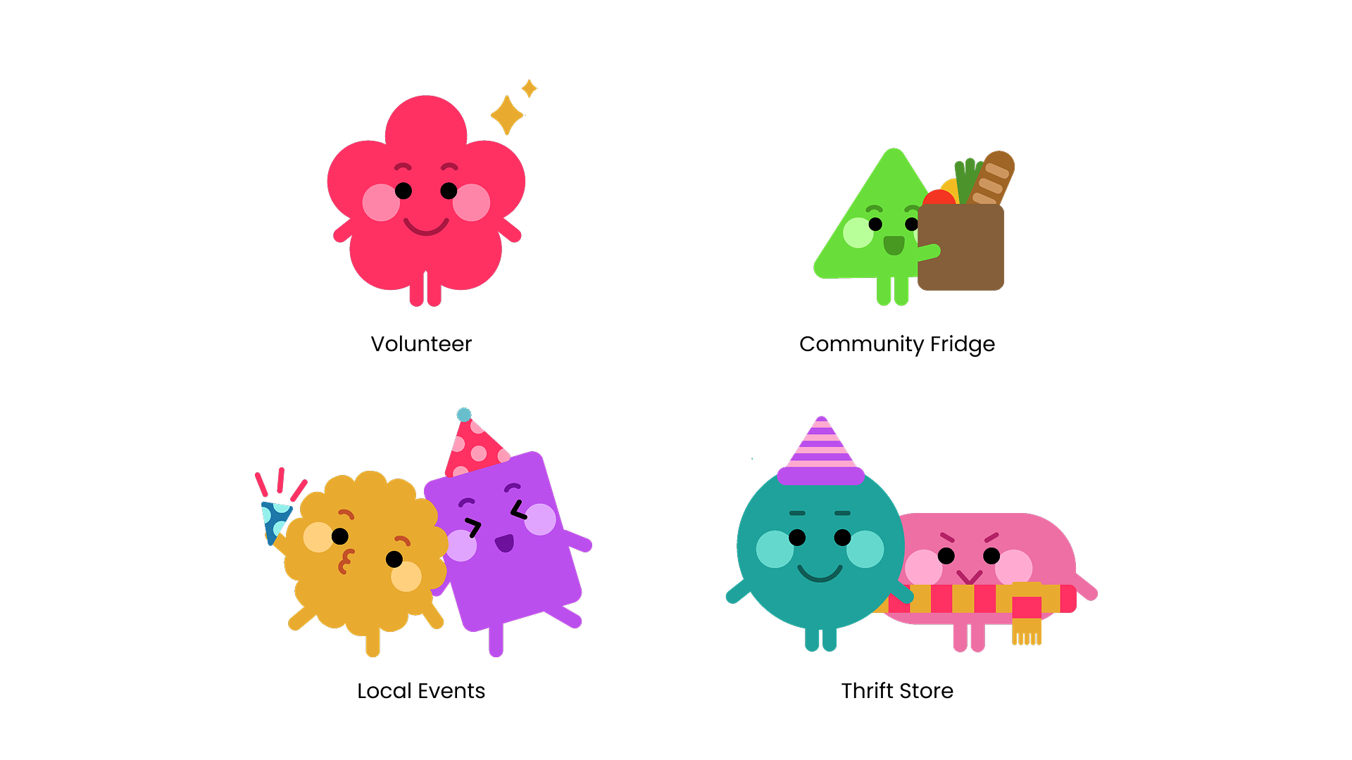
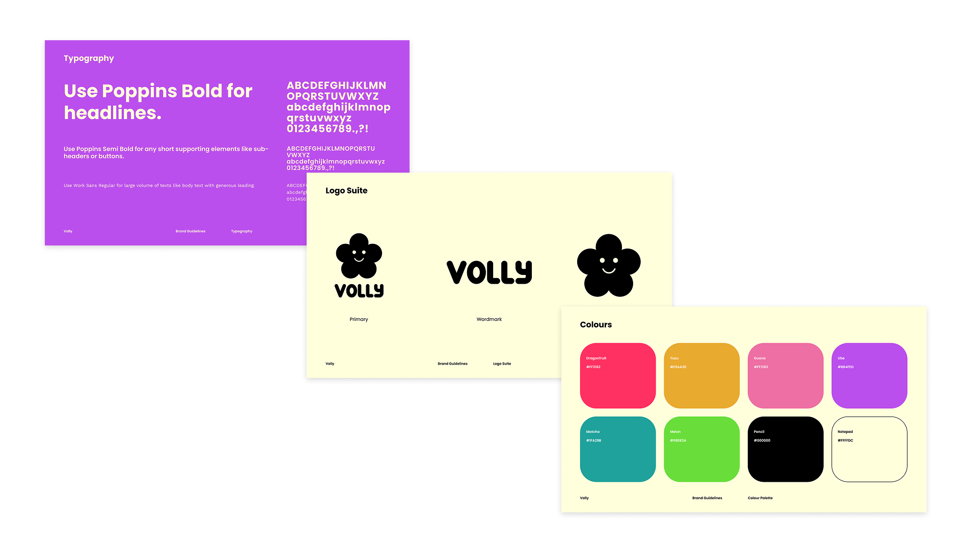
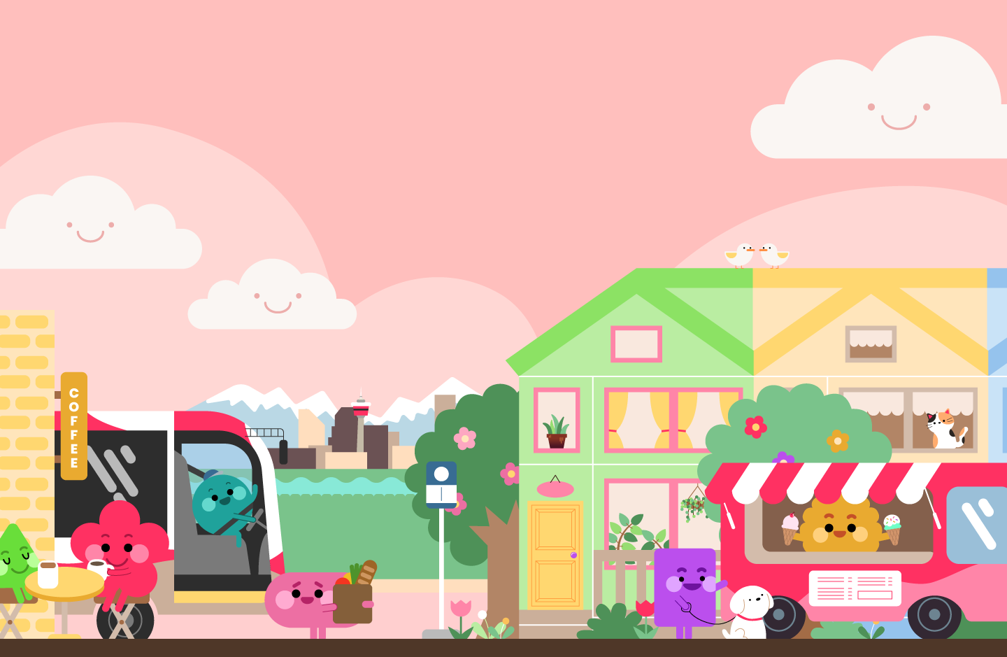
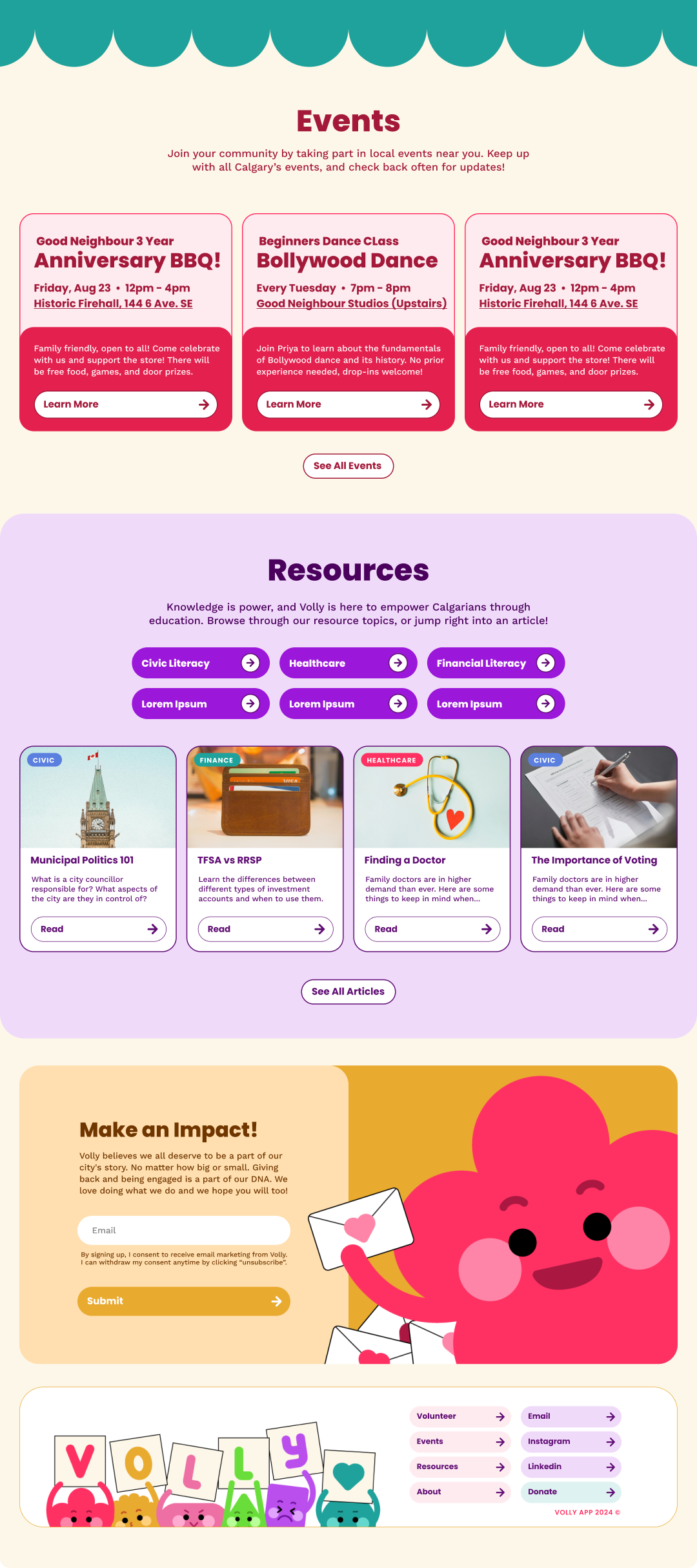
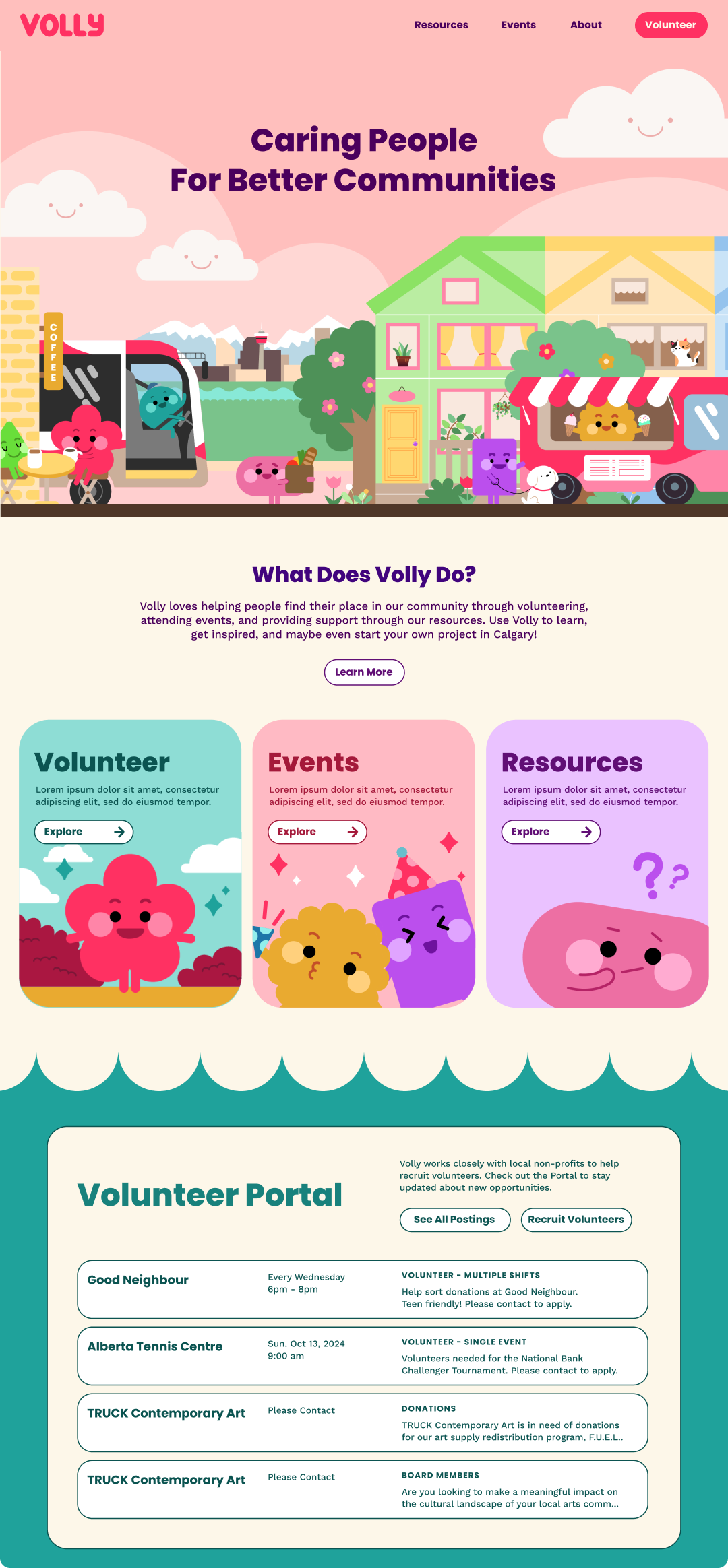
Volly is a local non-profit organization that focuses on strengthening the community through city-wide volunteering and civic education programs. I created a brand identity with custom illustrations to reflect their values and a website to amplify their voice.

Overview

My Role

Branding

Illustrations

UI/UX

Platforms

Desktop

Mobile

Partner

UI/UX/Web Dev: Trudy Tsan

Year

2025

The original product pages presented several issues that negatively impacted user experience and sales performance:

  • Cluttered Layouts: Overloaded with unnecessary information and poorly placed visual elements.

  • Confusing Navigation: Inefficient browsing and purchasing pathways, leading to user frustration.

  • Lack of Scalability: Designs were difficult to adapt to different brands and products.

The Challenge

The Opportunity

This redesign offered an opportunity to:

  • Enhance information clarity by establishing a clean, user-friendly layout.

  • Improve conversion rates by streamlining key user actions like adding to cart and viewing related products.

  • Build a scalable design system adaptable for various product types and brands.

Research & Discovery

To understand user pain points and business objectives, I:

  • Worked based on the existing user data to analyze browsing behaviours and pinpoint frustrations.

  • Reviewed analytics data to identify high-dropoff areas on existing pages.

  • Benchmarked competitive e-commerce platforms for insights into best practices.

Insights from analytics highlighted that the majority of the client's users accessed the platform via desktop. As a result, the redesign focused primarily on optimizing the desktop experience while ensuring responsiveness across devices.

After the research, we concluded what elements need to be prioritized in order to ease the user pain points and listed them out from P1 to P3.

The Approach

Design Framework

The redesign process centred on creating a flexible framework with a focus on:

  1. Visual Hierarchy: Highlighting key details such as product images, pricing, and CTAs (calls to action).

  2. Interactive Features: Integrating dynamic elements like image zoom, product variants, and recommendations.

  3. Responsive Design: Ensuring a consistent and seamless experience across devices.

  4. Customizability: Allowing easy adaptation to meet brand-specific requirements.

Collaboration & Testing

  • Partnered with engineers to ensure smooth implementation of interactive components.

  • Iterated designs based on client feedback, refining layouts and functionalities to enhance user satisfaction.

The redesigned product pages delivered measurable improvements:

  • Increased Engagement: Placing the image gallery at the centre of the page significantly increased the time users spent on each page. This design choice encouraged users to scroll and browse additional information, leading to deeper engagement with the content. Testing revealed that Product Page A, which emphasized detailed product information over brand and policy content, resonated more with the client’s clientele due to the hand-made nature of the items. Hotjar data and user feedback post-launch further validated this approach, showing users appreciated the clear separation of product details and found the layout easier to navigate.

  • Improved Usability: A cleaner layout and intuitive interactions led to higher user satisfaction.

  • Scalability: The modular design system allowed easy application across various product categories and brands.

This project highlights the power of user-centered design in transforming e-commerce experiences, blending aesthetic appeal with practical functionality.

The Results